Mobility
& beyond
The knowledge we share and the stories we love
-
 The European taxi and ride-hailing market is one of the most fragmented and competitive in the world. In this environment, the right technology stack can give a taxi business a decisive edge.
Top 5 Ride-Hailing Software Platforms in Europe in 2026
-
 A weak driver app leads to churn and lost revenue. Learn which features keep drivers engaged, boost efficiency, and turn your platform into a scalable operation.
Driver Apps in 2026: What They Need to Have and Why It Matters
-
 Planning to start a mobility company in Europe? Discover proven business models, niche opportunities, and tools that help operators grow in competitive markets.
How to Start a Mobility Business in Europe: Business Models & Services That Work
-
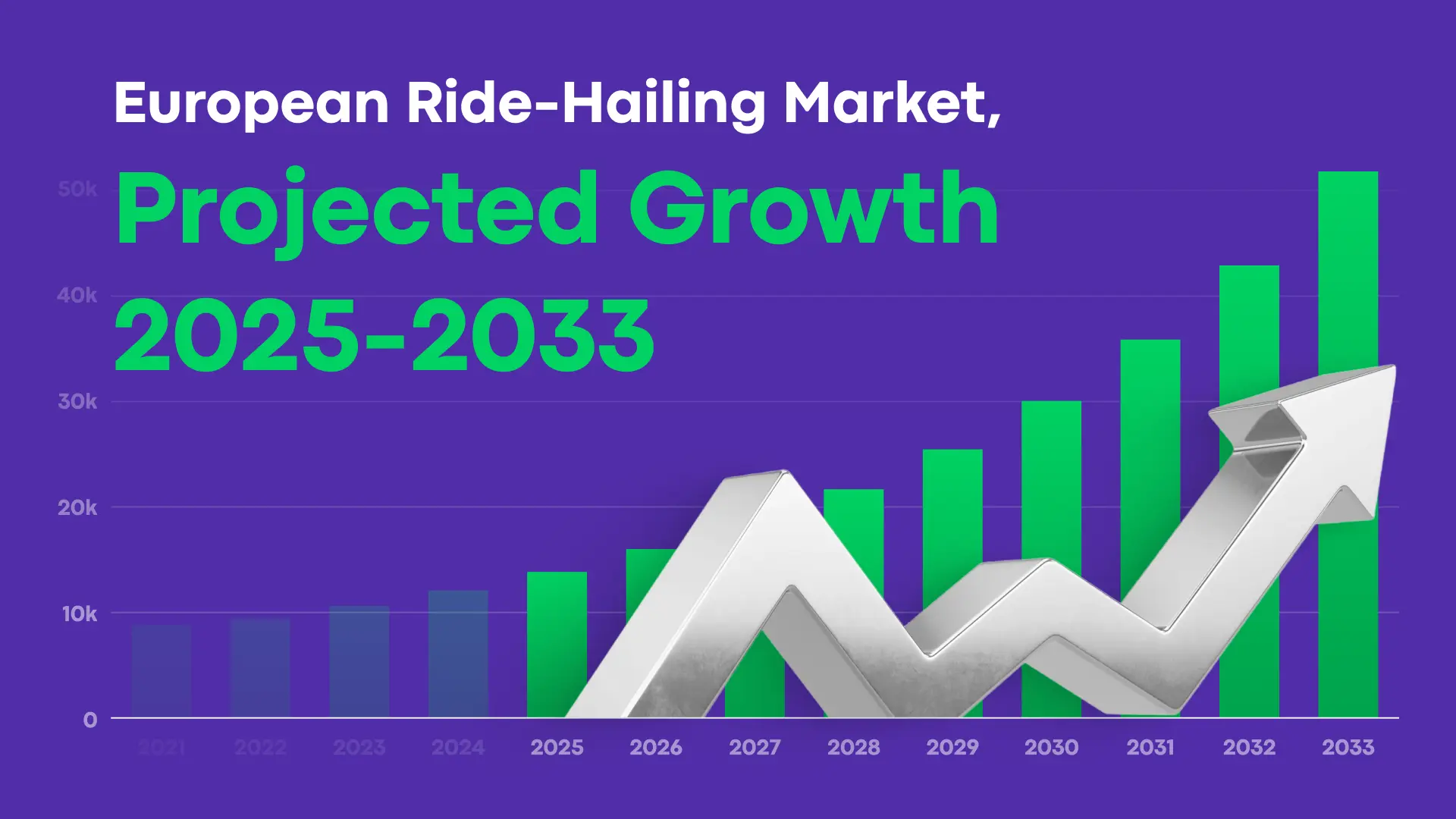 Learn about the key trends that are shaping taxi and ride-hailing across Europe right now, and get suggestions on how to adapt.
2026 European Mobility Report: Changes in the Taxi and Ride-Hailing Industry
-
 Mobility software is one of the main factors affecting how effectively you can handle and grow your ride-hailing or taxi business. Two platforms that get compared often in this space are Onde and TaxiCaller.
Onde vs. TaxiCaller: Which Platform For Taxi & Ride-Hailing Tech in 2026?
-
 If you’re building or growing a ride-hailing or taxi business, the platform you choose to power your tech stack defines how quickly you launch, how smoothly your operations stay, and how easily you scale. Two names that come up often are Onde and iCabbi.
Onde vs. iCabbi: Choosing the Right Ride-Hailing & Taxi Tech in 2026
-
 In this comparison, we break down Onde and Atom Mobility, two white-label platforms for powering modern mobility businesses. You’ll see how they differ on features, scalability, pricing models, and use cases. The goal of this comparison is to help you decide which platform fits your business model best.
Onde vs. Atom Mobility: Which Ride-Hailing Platform Should You Choose?
-
 Onde proudly announces the appointment of Martin Gallardo as our new Chief Executive Officer. Learn more about Martin in the article.
Welcoming a New Chapter at Onde: Introducing Our New CEO, Martin Gallardo

Product updates
-
 Unanswered reviews can hurt trust and downloads. Onde Auto Replies help manage feedback faster and support stronger app store performance.
New in Onde: Boost App Ratings with Auto Replies
-
 In the latest release, we’ve introduced several improvements to make daily operations more transparent and flexible.
Smarter pricing, smoother onboarding, and more automation
-
 Learn how your taxi business can use Onde app notifications to engage users, run promotions, partner with brands, and collect feedback.
6 Ways to Use Onde's Notification Center for In-App Marketing
Aiming for the Stars?
Subscribe to get helpful guides and product updates in your inbox!

We will get in touch with you shortly