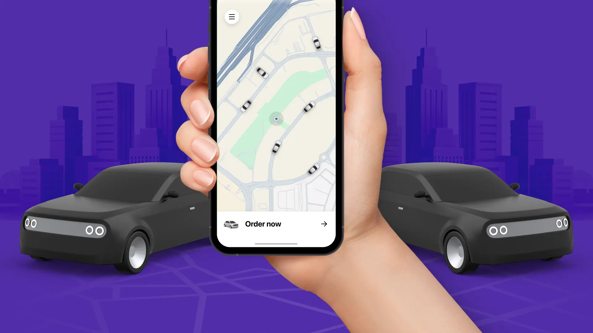
 Continue reading this article for some of the best practices to consider when designing and maintaining your ride-hailing site.
1. Streamlined Navigation
One of the primary factors in user satisfaction is ease of navigation. Your ride-hailing site should have a clean, simple layout with intuitive menus and buttons. Users should be able to book a ride, view pricing, and access customer support with minimal clicks. A clear navigation layout can improve the user experience and decrease the risk of users getting frustrated and leaving your site.
2. Mobile Optimization
Given that many ride-hailing users access services via their smartphones, your site must be fully optimized for mobile devices. This means responsive design, fast load times, and touch-friendly interfaces. Mobile optimization ensures that users can quickly book rides and access essential information on the go, providing a seamless experience across all devices.
3. Accessibility Compliance
Ensuring your ride-hailing site meets accessibility standards isn't just good practice; it's also a legal requirement in many regions. For instance, adhering to ADA website compliance guidelines ensures that your site is usable by individuals with disabilities, thereby broadening your user base and promoting inclusivity.
ADA website compliance ensures that websites follow the ADA or Americans with Disabilities Act (ADA) standards for accessibility. The ADA, founded in 1990, is designed to stop discrimination against people with disabilities and mandates that public places, like websites, are accessible to everyone. Focused initially on physical locations, the ADA now covers digital platforms, guaranteeing equal access to online content and services for people with disabilities.

ADA compliance is crucial for ride-hailing websites as it ensures all users, including those with disabilities, can access and utilize the services provided. Here's how ADA compliance applies:
- Text Alternatives: Provide text descriptions for images, icons, and buttons in the booking interface. This helps screen readers interpret visual elements for users with visual impairments.
- Keyboard Accessibility: It's important that all features, like booking rides, managing accounts, and processing payments, can be easily used with a keyboard, especially for users who can't use a mouse.
- Readable Content: Use clear and simple language throughout the website. Avoid jargon and provide easy-to-understand instructions for booking rides, accessing support, and managing accounts.
- Consistent Navigation: Create a navigation structure that is easy to follow and consistent. This will help users with cognitive disabilities navigate the website more easily.
- Color Contrast and Text Size: Frequently check color contrast to guarantee that the text is clear and easy to read against the background colors. Give users the option to change the text size based on their preferences.
- Form Labels and Instructions: Clearly label all form fields and provide instructions or error messages that are easily understandable. This assists users with cognitive disabilities in completing forms accurately.
- Video and Audio Content: Provide captions and transcripts for video and audio content, ensuring that users with hearing impairments can access the information.
- Error Prevention: Implement features that help prevent errors, such as confirmation steps before finalizing a ride booking, and provide clear options for correcting mistakes.
It's crucial for ride-hailing websites to comply with ADA regulations to provide equal access to their services for everyone, including individuals with disabilities. By following the WCAG guidelines and implementing accessibility features, ride-hailing services can create a more inclusive, user-friendly environment, demonstrating their commitment to accessibility and improving their overall user experience.
4. High-Quality Visual Design
A visually appealing site enhances user experience and builds its credibility. Here are some key strategies to achieve this:
- Simplify the Layout: A minimalist and sleek layout helps users find their way around your website more easily. Avoid clutter by using ample white space, which separates different sections and makes the content more digestible. Employ a grid system to ensure a consistent layout. This helps align elements on your page, creating a balanced and organized look.
- Use High-quality Images and Icons: It's crucial to use high-resolution images that convey your brand and services effectively. Avoid generic stock photos and opt for images that resonate with your target audience. Design or commission custom icons that align with your brand identity. Custom icons can make your site look more cohesive and professional.
- Consistent Branding: Using your brand colors consistently throughout your site reinforces brand recognition and creates a unified look. Pick a font that represents your brand's identity and is effortless to read. Use only one or two fonts to keep a consistent and cohesive visual style.
- Engaging Visual Hierarchy: Establishing a clear visual hierarchy to guide users through your site is essential. Use size, color, and positioning to indicate the importance of different elements. For example, primary call-to-action buttons should stand out more than secondary ones. Ensure critical information, such as booking options and pricing, is prominently displayed. Use contrasting colors and larger fonts to draw attention to these elements.
- Interactive Elements: Incorporating subtle animations and transitions can provide feedback and improve user engagement. Examples include button hover effects, loading animations, and progress indicators during the booking process. If your service includes real-time tracking or location selection, use high-quality interactive maps that are easy to navigate.
High-quality visual design on your ride-hailing website involves a combination of aesthetic appeal, usability, and accessibility. Ultimately, investing in high-quality visual design will lead to higher user satisfaction, increased engagement, and a more substantial brand presence in the competitive ride-hailing market.
5. Fast and Reliable Performance
Your website's performance is crucial in the ride-hailing industry, where users expect quick and reliable service. Slow load times can really annoy users, and they might start looking for other options. Ensure your website is fast by compressing images, using browser caching, and cutting down on heavy scripts. Regularly monitor your site's performance and make necessary adjustments to maintain optimal speed and reliability.

6. Clear and Concise Content
The information on your ride-hailing site should be clear, concise, and easy to understand. Avoid jargon and use straightforward language to explain your services, pricing, and policies. Provide clear instructions for booking rides and accessing customer support. Users appreciate transparency and simplicity, which can enhance their trust in your service.
7. Secure Payment Systems
Users prioritize security when entering their personal and payment information. Your ride-hailing platform must utilize secure payment gateways and adhere to industry regulations for data protection. Show security badges and share details about your platform's security protocols to give users peace of mind about the safety of their information.
8. User Feedback Mechanisms
Implementing feedback mechanisms allows users to share their experiences and suggestions for improvement. This can include ratings, reviews, and direct feedback forms. Taking user feedback into account and implementing changes shows that you appreciate their input and are dedicated to improving their experience.
By prioritizing these elements, ride-hailing services can ensure a smooth and satisfying user experience, fostering customer loyalty and trust. In an increasingly competitive market, a user-friendly website is a powerful tool to set your service apart and drive success.

Conclusion
Creating a user-friendly ride-hailing site involves sound design, accessibility, performance, and security. By following these best practices, you can ensure that your site attracts new users and retains existing ones, providing a reliable and satisfying ride-hailing experience for all.
Author Bio
Liza Leonard is a digital marketing expert with over a decade of experience in the ride-hailing industry. She specializes in creating user-centric websites that enhance customer engagement and satisfaction, and her passions lie in helping businesses thrive in the competitive online marketplace. In her free time, Liza loves spending time outdoors hiking or at home caring for her plants.
Like the article? Share it with your friends!


